More in less
In the newspaper game, white space is the enemy. Generally speaking, anyway. It's a waste of space that could otherwise be used for words, an ad, a photo, a graphic. Online, in my realm, white space signifies a lack of balance. It begs to be filled.
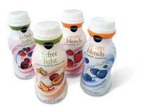
Apparently, I'm not alone in noticing that my favorite supermarket chain, Publix, has taken the concept of white space to a new level. They've mastered its emptiness and used that generic feel to their advantage. Several creative design websites monitoring corporate advertising and packaging art have lauded Publix for their private brand packaging, which doesn't seek to emulate noted national brands. Nothing that's in a Publix brand box looks like something Kraft or Campbell's put out. Publix's creative design department thinks differently: They *want* their store brands to stand out from the higher-priced stuff and the simplicity of their packaging, its clean look and catchy "chatter" on the labels works precisely because of the old graphic designer's mantra, which so many package designers have forgotten: Less is more. None of this pretty, simple, classy packaging means diddly-squat if the Publix brands are terrible and they most certainly aren't. In fact, I prefer them over most high-cost brands; they're usually much tastier.
"Chatter" is a newspapering term for the conversational, off-the-cuff copy that's used to tease a story (and again, often to fill space). Publix designers use chatter well on labels. The chatter offers you a short history of tea:
 "Tea originated in ancient China more than 5,000 years ago, and ever since has provided the world with a relaxing pause of refreshment." It educates you on how the thiamin in Publix brand "almonds & oats" cereal aids in your workout: "During intense exercise, thiamin helps control lactic acid your muscles produce and convert it to glucose, which is then used for energy." And in perhaps the most ingenious and certainly the most hilarious chatter I've ever read on any product, someone at Publix even gets right to the point about toilet tissue etiquette on the back of the Super Soft 12-pack: "Let's end the debate about the correct way to place bathroom tissue on the roll: Offer the user a tissue by placing the free end away from the wall. It's easier to grab and makes a much nicer presentation."
 Now *that's* a supermarket chain with moxie, y'all.
posted by rekkidbraka @ 5:03 PM
![]()


4 Comments:
Now that toilet paper "etiquette" is information I can really use...
I always like finding random bits of information everywhere. Good to see Publix is trying.
Do you have HEB Central Market in A-town? I think it might just be Texas (we don't have Publix). Their store-brand stuff is quality-- there's this spicy red pepper pasta sauce that is just to die for. It's great that you can have low prices and integrity at the same time.
As for the toilet paper, I tend to agree, but my roommates and I go through the stuff so quickly that if it accidentally gets put on weirdly, there's no way I'm going to possibly care enough to fix it. :)
OKay, and now I have that obnoxious Target ad stuck in my head: "Chocolate! With Moxie! Choxie!"
Their store brand stuff isn't half-bad either, though I haven't tried the sweets.
Oh, how I heart Choxie. We don't have the chain you mentioned, Janna, but we ARE getting - drum roll, please - Trader Joe's in the near future. I can't wait. *swoon*
Post a Comment
Subscribe to Post Comments [Atom]
<< Home